

Maximo UI Evolution and Things to Ponder- Dear IBM Maximo product team :-)
Maximo's UI has evolved significantly over the years and this is one of those topics that not much spoken about. Its important to look back and see how things can evolve over the next decade.

Happy Morning/Evening to our readers and today we are going to talk about Maximo UI. I felt this topic is something that is super important as MAS 8.0 is spearheading the next generation of Maximo products in the decades to come.
From its early versions to more recent iterations, the UI of Maximo has seen several changes aimed at enhancing user experience, improving usability, and adapting to modern design trends. Here's a brief overview of the evolution of Maximo's UI:
Classic UI (Pre-Version 7):
In the early versions of Maximo, the UI followed a classic design typical of enterprise software from the late 1990s and early 2000s.
The interface was primarily based on tables and forms, with a heavy reliance on text-based navigation and functionality.
While functional, the classic UI lacked the visual appeal and user-friendliness of modern software interfaces.
Version 7 UI Enhancements:
With the release of Maximo version 7, IBM introduced significant enhancements to the UI, including improvements in layout, navigation, and usability.
The interface became more intuitive, with streamlined workflows and better organization of information.
However, the overall design still retained elements of the classic UI and didn't fully embrace modern design principles.
Maximo Anywhere:
Maximo Anywhere, introduced in later versions, provided a mobile solution for accessing Maximo data and functionality on smartphones and tablets.
The UI of Maximo Anywhere was optimized for touchscreens, with a focus on simplicity and efficiency.
It featured responsive design elements to ensure a consistent user experience across different devices and screen sizes.
Maximo Everyplace:
Maximo Everyplace extended the reach of Maximo to web browsers, allowing users to access Maximo from any supported web browser without requiring a separate client installation.
The UI of Maximo Everyplace was designed to be responsive and adaptable to various screen sizes and resolutions.
It provided a more modern web-based experience compared to the traditional Maximo client.
Version 8+ Modernization:
In more recent versions of Maximo (post-Version 8), IBM has continued to modernize the UI, adopting contemporary design principles and technologies.
This includes improvements such as a cleaner and more visually appealing interface, enhanced usability through intuitive navigation and task flows, and better support for customization and personalization.
IBM has also introduced features like dashboards, analytics, and role-based interfaces to tailor the user experience to different user roles and preferences.
Workcenter to Maximo Mobile Modernisation
Overall, the evolution of Maximo's UI reflects a broader trend in enterprise software towards more user-centric design and usability. With each iteration, IBM has sought to improve the accessibility, functionality, and aesthetics of Maximo's interface to meet the evolving needs and expectations of its users.
Some of the key highlights of this journey:
Evolution of Maximo skins to provide flexibility to users
Evolution of Google Polymers to Graphite implementations (Workcenters to Maximo Mobile)
Evolution of conventional UI to Carbon Design language
Standardisation of Carbon Design language across their flagship products
Placement of key actions/select actions/ flexibility in navigation bars
Flexibility in customisation options in the form of application designers based on form factors (mobile/desktop)
Customisation options on Maximo Mobile with simplified architecture
However…things have to keep improving and here is a Wishlist that we can come up with:[some of them exists either partially or not visually appealing or very difficult to implement]
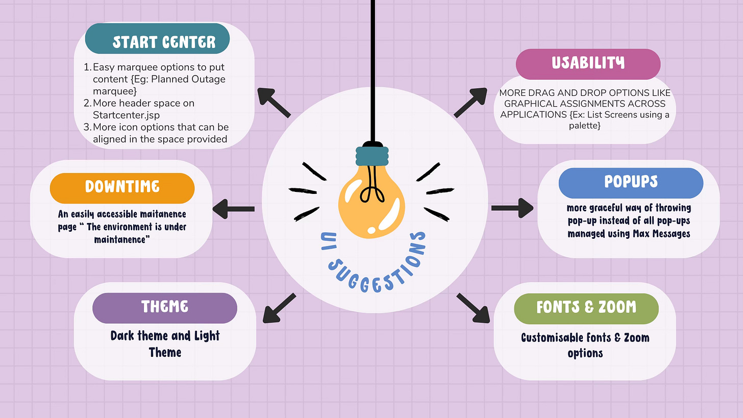
StartCenter Suggestions:
Elegant pop-up messages to present to the user as soon as they login
Elegant Marquee options to present releases/outages to Maximo
Customisable colouring for startcenters (its my landing page and hence if I can customise it would be visually appealing)
Timezone options available as toggles in Starcenters
Dark vs Light theme
Moveable Widgets [clock, date, time , custom welcome message, calendar etc]
Resizable portlets
Outages:
Elegant message to be hosted in the form of a http page that shows Maximo is down for maintenance [the current provision needs an overhaul]
More meaningful messages than 500 Internal Server error
Customisable fonts, font sizes/ zoom in and out options
Graceful presentation of pop-ups vs max messages
Enable drag and drop options across application
Browser notifications
Remember my last logged in module
Customisable navigation bar (List of modules vs list of applications)
Is ‘New Row’ required for every row ? How about adding new rows without new rows…
Customisable right clicks
Easily uploadable / integratable Photos for user ids as part of MaxUser setup
A separate My Account Page (User id, phone, email, person, labor deeply integrated in My Account page)
A simple News feed section
Freeze page options to avoid scrolls and filter with options (Selectable 50,100 rows per page)
Easily manageable collapsable sections when using table sections
and much more…
Conclusion:
As users continue to embrace the new Maximo UI and upgrades, there's always room for further improvements to enhance usability, efficiency, and overall user experience and above are some thoughts that would lead to that conversation. I am sure IBM would be working on many of these and hoping to see them in the future in IBM MAS releases.
What do you think ? How can we improve the usability further ? Leave your comments and I shall consolidate the article further.
Cheers, Venkat